


Eleforms Chosen Field is a plugin that allows you to add a Chosen field to the Elementor form. The chosen field has more features and better styling than the default select option field. Some features are the ability to search options easily, a better multiple-select interface, the ability to set placeholders, and limit the maximum selection.
Requirements
This plugin is an Elementor Pro addon. Hence to use this plugin you need
- WordPress – https://wordpress.org/
- Elementor – https://wordpress.org/plugins/elementor/
- Elementor Pro – https://elementor.com/pro/
Third Parties Documentation
- https://elementor.com/help/get-started-with-elementor/
- https://elementor.com/help/elementor-editor/working-with-forms/
How to Add Chosen Field
Select the form that you want to add to the Chosen field. You will see the Edit Form panel on the left of the Elementor editor. Under the Form Fields section click Add Item. A new field item will be added to the Form Fields section. Change the field type to Chosen and set the field controls as you want.
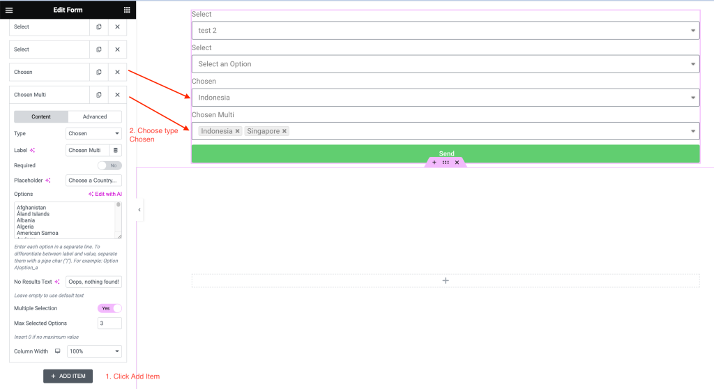
The chosen field has these controls:
- Label: text to show above the field.
- Required: make this field required or not.
- Placeholder: add placeholder text to the field.
- Options: options to add to the chosen field. Each option is in a separate line. You can differentiate between the label and the value by using pipe char(“|”). For example: Option A|option_a
- No Result text: the chosen field supports search functionality. Add text here to show when no result is found.
- Multiple Selection: whether to allow users to choose multiple options or not. If you enable this option, the Max Selected Options setting will appear.
- Max Selected Option: you can limit the maximum selected option here.
- Column Width: set the width of the field within the container.
How to style the Chosen field
The plugin has some controls to style the field. Hence, no coding is required to make the field match your form. To access the controls, click the Style tab and expand the Chosen section.
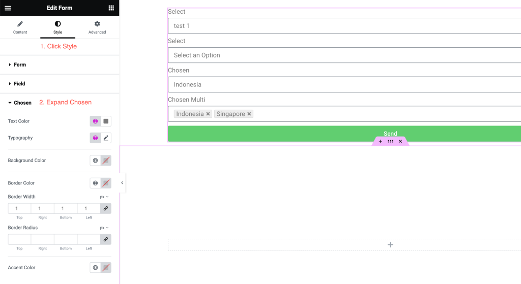
Here are the styling controls:
- Text Color: change the text color.
- Typography: change the text typography. You can set the font, font size, line height, etc here.
- Background Color: set the color of the field background.
- Border Color: set the color of the field border.
- Border Width: set the width of the field border. You can set the border width individually for the top, right, bottom, or left border.
- Accent Color: set the background color of the selected/hovered option.